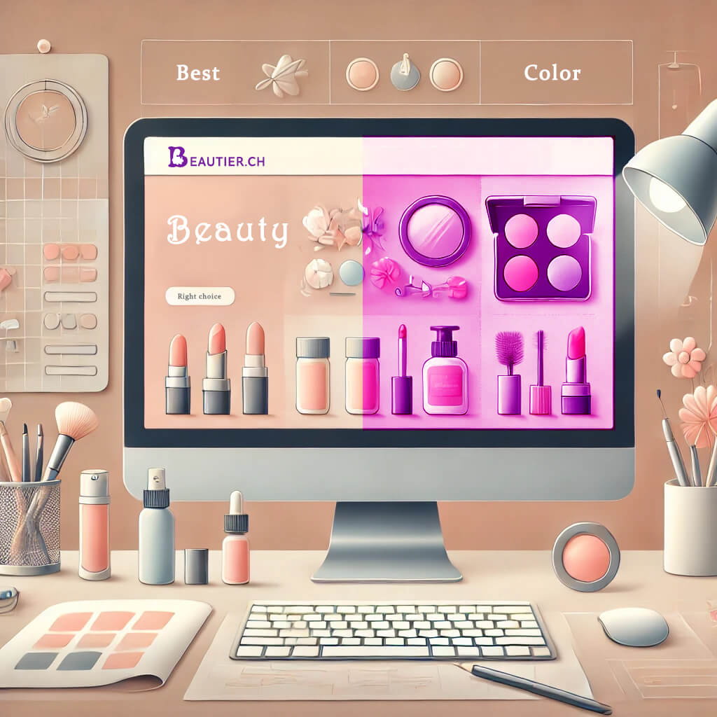
Color Mistakes in Beauty Design: Which Shades to Avoid and Why

When creating a website for the beauty industry, it is important to choose colors that meet the expectations of the target audience and convey emotions related to beauty, style, and care. Certain colors are best avoided to ensure that potential clients are not discouraged or given the wrong impression.
Colors to Avoid:
- Bright Neon Colors (Neon Green, Yellow, Pink)
- Why to avoid: These colors can be overly aggressive and irritating. They create a sense of oversaturation and can distract users from the main content. Neon shades are often associated with something flashy and cheap, which does not align well with brands aiming to convey a sense of luxury and professionalism.
- Dark Brown or Dull Green
- Why to avoid: These shades can evoke something unappealing, especially when it comes to cosmetics and body care. In the beauty sphere, it’s important to convey a sense of freshness, cleanliness, and elegance, which is challenging to achieve with these shades.
- Overly Dark and Gloomy Colors (e.g., Black, Dark Gray in excess)
- Why to avoid: Dark colors can create a gloomy mood and make it difficult to perceive information. While black can be used to create accents and add elegance, excessive use makes the website feel too heavy and inaccessible.
- Very Bright Red
- Why to avoid: Red can symbolize passion and energy, but in an overly bright form, it is also associated with aggression and urgency, which is not always appropriate for beauty websites. Furthermore, bright red can distract and cause stress.
Colors to Use with Caution:
- Pure White
- Why use with caution: White represents cleanliness and minimalism, but overuse can make the site feel too sterile and “empty.” It’s better to combine it with soft tones to add warmth and harmony.
- Pure Yellow
- Why use with caution: Yellow can add optimism and joy, but excessive use can strain the eyes and distract from the main content. It’s best used as an accent.
General Recommendations:
- Avoid overloading with too many bright colors. A beauty-themed website should be harmonious and relaxing so that users feel comfortable.
- Use soft transitions and avoid harsh contrasts that can strain the eyes.
- Always consider the target audience. Colors should evoke positive emotions and match the brand—creating an impression of care, luxury, or professionalism, depending on the brand’s position.
Choosing the right colors is key to creating a successful website that attracts attention and evokes positive emotions in users.