Words That Turn Visitors into Customers: Microcopy, Button Copy, Service Descriptions, and Feedback Forms
When developing a website, most attention is usually given to the visual component — design, photos, graphic elements. Text content, especially micro-copy on buttons, often ends up in second place, even though it is the short phrases in the interface that largely determine user experience and conversion.
Good copy in the interface and on the site not only looks nice, but also works more effectively — attracting, persuading, selling.
Button texts
Button texts are not just random words; they are a separate language of the interface. They come in many types, each with its own task. Some buttons call for a key action (“Place order”), others help refine a choice (“Compare options”), a third group guides the user through process steps (“Next”, “Back”), and a fourth closes unwanted windows (“Hide notification”). Well-chosen micro-copy directs attention, reduces doubts, and quietly leads the person to the goal, making interaction with the site easy and intuitive.
The main purpose of button text is to nudge a person toward a specific action and make that action clear and attractive.
What needs to be achieved and why it matters:
- Prompt action — use a verb (“Buy”, “Download report”). The user decides what to click faster and is less likely to leave without clicking.
- Explain the result — the person should understand what they will get (“Get a 10 % discount”). This reduces doubts and increases conversion.
- Lower cognitive load — the button replaces long instructions. The less a person thinks about “what happens next”, the higher the chance of action.
- Set the brand tone — micro-copy helps sound friendly or expert (“Let’s go!”, “Start analysis”). A consistent style builds trust.
- Match the context — the text should logically continue the previous step. The user feels “flow” and does not get lost.
- Consider accessibility — clear, short phrases + alt text for screen readers. This makes the interface understandable for all users.
In all these situations simple rules apply, which can be briefly summarized.
Rules
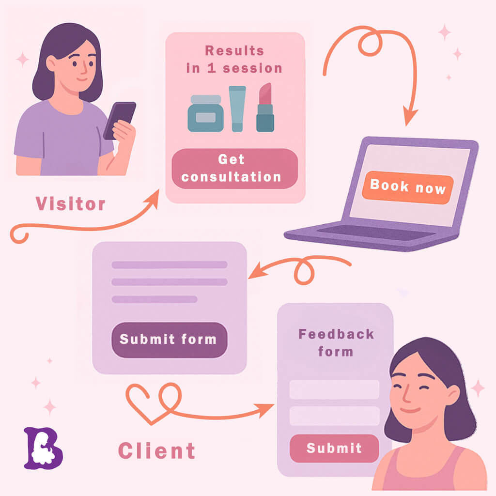
• Be specific: instead of “Submit” — “Get consultation”, “Download price list”, “Book a trial”.
• Use a verb: it prompts action. Better “Buy” or “Sign up” than “Form” or “More info”.
• Keep it short but clear: 1–3 words.
• Account for context: if a request form came before, the button is “Submit request”, not just “Next”.
Examples:
• ✅ Get a discount
• ✅ Start learning
• ✅ Find out the price
• ❌ More details
• ❌ Ok
Service descriptions
A service description is not just a list of characteristics, but a full-fledged dialogue with a potential client. Its main task is to clearly and convincingly show the benefit of the offer so that the person chooses you without hesitation.
For the text to really “work”, it is important to follow several principles that directly affect readability and perception.
Key principles of service descriptions:
- Focus on the result, not the process. Tell what benefit the client will get (“Skin becomes smooth after the first session”), not what devices you use.
- Client language. Avoid professional jargon and bureaucratic wording. Write as you speak to the client in person — short, clear, friendly.
- Structure “problem → solution → benefit”. Such a scheme keeps attention and consistently leads to purchase.
- Micro-promises and proof. Concrete numbers, cases, reviews, and certificates build trust.
- Eye-friendly layout. Short paragraphs, subheadings, bullets, and icons make the text “airy” and easy to scan.
- Call to action. At the end be sure to indicate the next step: “Book a consultation” or “Download the price list”.
Rules:
• Don’t describe the process, talk about the result: “You’ll get an even skin tone in 2 sessions”, not “We use X devices and Y masks”.
• Talk about the clients, not about yourself: less “we”, more “you”.
• Break into blocks: problem → solution → benefit → price/format.
• Write simply: no complex terms or bureaucratese.
• Add trust elements: cases, reviews, certificates, before/after photos.
Example:
🌿 Facial cleansing
We’ll eliminate blackheads and oily shine in a single procedure. After the cleansing your skin will become cleaner, softer and fresher — without flaking or redness.
💬 Suitable for any skin type.
⏱ Duration: 60 minutes
💰 Cost: ₣, €, $.
By following these rules, you turn a service description into a clear, value-packed, convincing narrative that not only informs but also leads the client to a decision.
Feedback form
A feedback form is a polite invitation to dialogue, not a bureaucratic barrier. How you “voice” it determines whether a person leaves their data or quietly closes the page. To make the text truly welcoming, consider several key nuances:
- Clear promise of value. State why the fields should be filled in:
- “Leave your phone number — we’ll pick the right plan and send you the price list within an hour.”
- Minimum fields, maximum clarity. The simpler the request, the higher the conversion. If name and phone are enough, don’t ask for date of birth and job title.
- Transparency of next steps. Tell what will happen next:
- “After sending, our specialist will call you, ask two clarifying questions and immediately offer a solution.”
- Confidentiality guarantee. A short note “We don’t share contacts with third parties” removes concerns and increases trust.
- Friendly micro-copy on the button. Replace the faceless “Submit” with “Get consultation” or “Ask an expert” — the user immediately understands the result of the action.
- Stress-free error messages. Phrase hints and error messages in a positive, supportive tone:
- “Looks like the ‘@’ is missing in the email. Please check it.”
- Visual rhythm. Short lines, clear labels for fields, and comfortable line spacing help the eye “glide” through the form without stumbling.
- Accessibility support. Clear text labels, sufficient contrast, and understandable placeholders make the form convenient for everyone, including screen-reader users.
By observing these nuances, you turn the feedback form into a friendly “entry point” through which a potential client easily and willingly makes contact.
Rules:
• Explain why the form exists: “Leave your number — we’ll contact you and suggest the best option.”
• Remove extra fields: only name and contact are enough.
• Replace “Submit” with a clear button (see above).
• Add a micro-promise: “No one will spam-call you” or “We reply within 30 minutes”.
• Clarify what happens next: “After sending, our manager will call you and help choose a service.”
Example:
📩 Any questions left?
Leave your contact — we’ll help choose care and answer everything.
[Your name]
[Phone or email]
✅ Get consultation
A successful interface is the harmony of visuals and copy. Design draws attention, yet it is the carefully crafted wording — from micro-copy on buttons to service descriptions and lines in the feedback form — that guides the visitor, removes doubts, and turns interest into a targeted action.
When every label clearly reflects value, speaks the audience’s language, and leads along an understandable scenario, the site begins to work as a single, convincing mechanism: it discreetly informs, engages, and sells. Invest time in copy as generously as in visuals — and your digital product will repay this care with increased trust, conversion, and customer loyalty.